Technical Support
SUBSCRIBE TO OUR MAILING LIST!Industry news, technical advice and company announcements, straight to your inbox.


Choosing a render colour can have a major impact on the finished appearance of an external wall insulation or render project. With such a wide range of shades available, however, narrowing down the options is not always straightforward.
So, which colours are actually being chosen most often?
We analysed our EWI-075 Silicone Render tinting data to identify the shades that account for the greatest share of our colour-tinted render.
The ranking combines all EWI-075 grain sizes included within the data and looks at each colour as a percentage of overall EWI-075 volume. Where the same colour code appeared under more than one entry, we consolidated the data by colour code to provide a more accurate ranking.
The results show a particularly strong preference for whites, greys and softer neutral shades, with our top 10 colours accounting for approximately 66% of EWI-075 in the dataset.
Based on our tinting data, the top 10 shades are:
| Rank | Colour | Colour code | Share of EWI-075 |
| 1 | Pure White | 20001 | 29.5% |
| 2 | Smoke | 27416 | 8.0% |
| 3 | Ash | 27412 | 7.7% |
| 4 | Brilliant White | 10001 | 3.6% |
| 5 | Platinum | 28080 | 3.1% |
| 6 | Magnolia | 28036 | 3.1% |
| 7 | Ivory | 28018 | 3.1% |
| 8 | Diamond | 27420 | 2.8% |
| 9 | Lead | 27554 | 2.6% |
| 10 | Sandstone | 28070 | 2.6% |
The percentages above are based on the full EWI-075 dataset rather than only the colours appearing in the top 10.
Pure White is comfortably the most popular shade in our EWI-075 Silicone Render tinting data, accounting for approximately 29.5% of the total.
That puts it considerably ahead of every other individual colour in the ranking.
White render is an extremely versatile choice. It can suit both traditional and contemporary properties and works particularly well where the aim is to create a clean, simple elevation.
It can also create strong contrast alongside darker architectural features such as anthracite windows, doors, roof finishes and trims.
For EWI projects, this versatility is valuable. External wall insulation can transform a large proportion of the visible façade, meaning the chosen render colour needs to work successfully across the whole building rather than just a small decorative area.
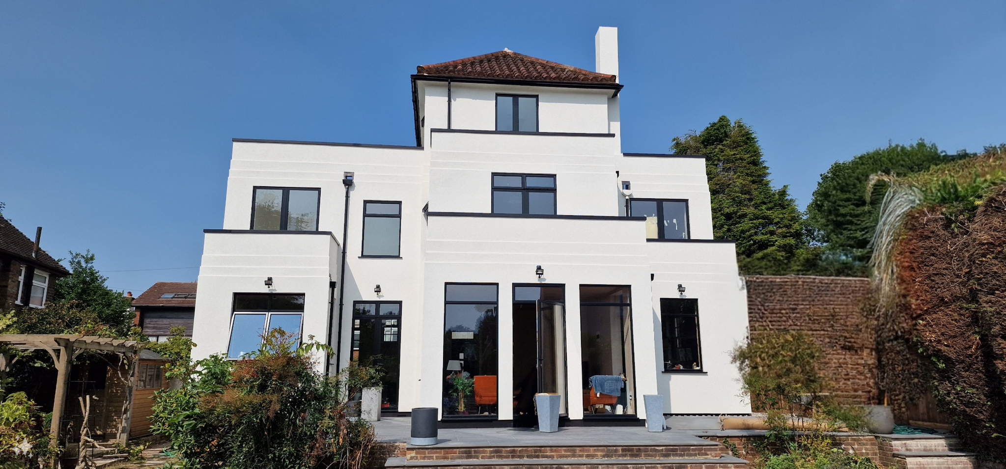
Below is an example of a project finished in the colour Pure White, installed by EZ Design and Construction
Smoke takes second place, accounting for approximately 8.0% of EWI-075 in our data.
Its position reflects the strength of grey and grey-influenced shades within modern render specifications.
Neutral greys can work particularly well alongside contemporary windows, darker roof finishes, brickwork and other façade materials without becoming overly dominant.
They can also provide an effective alternative to white where a project requires a slightly softer or more contemporary appearance.
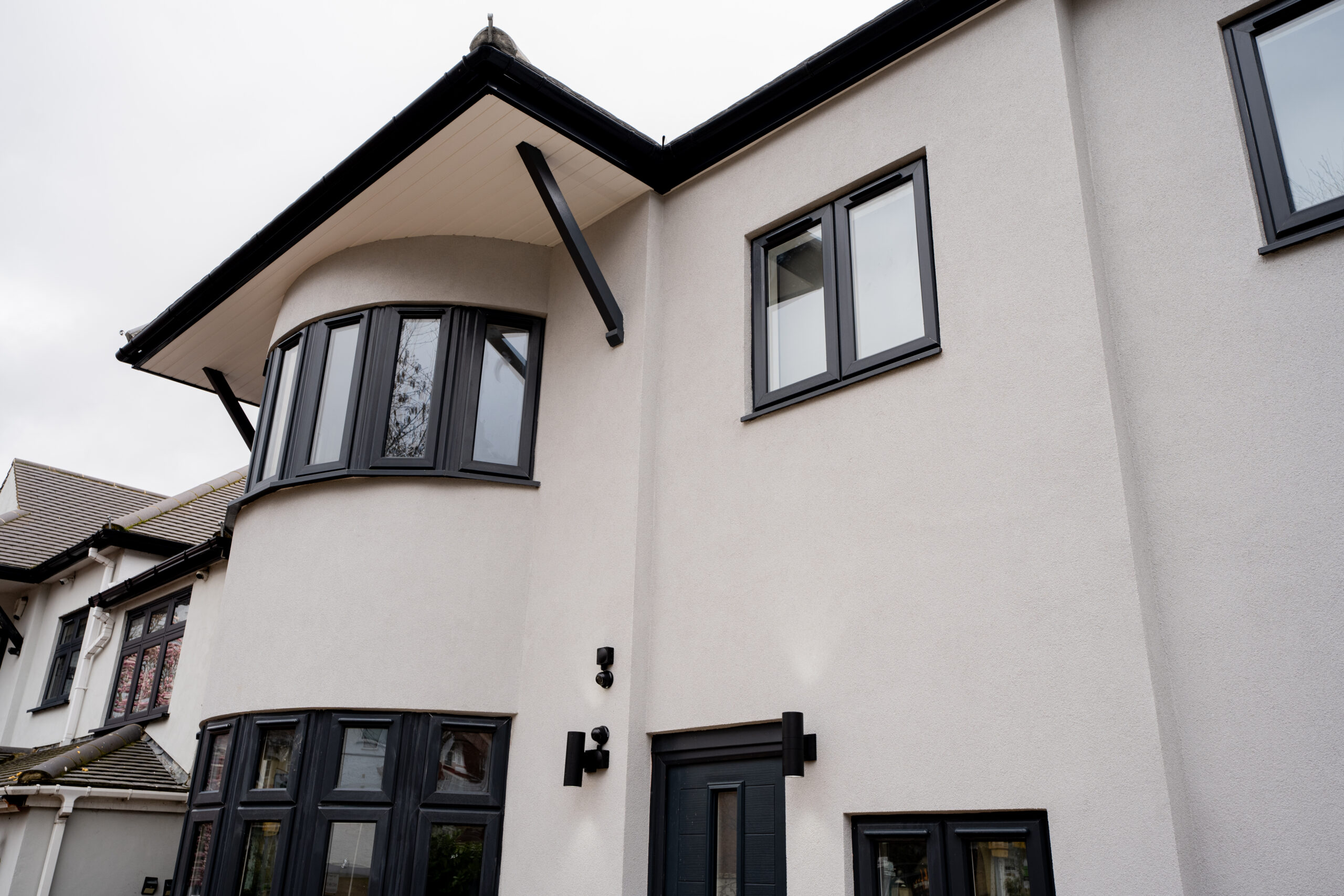
Below is an example of a project finished in the colour Smoke.
Ash follows extremely closely behind Smoke, representing approximately 7.7% of EWI-075.
The small difference between our second and third most popular shades highlights just how prominent neutral grey tones are within the data.
When choosing between closely related shades, however, it is worth considering more than the colour in isolation.
Window frames, doors, roofing materials, brickwork and the orientation of the building can all influence how a shade appears across a finished elevation.
This is one reason we recommend viewing a physical colour sample before making the final specification.
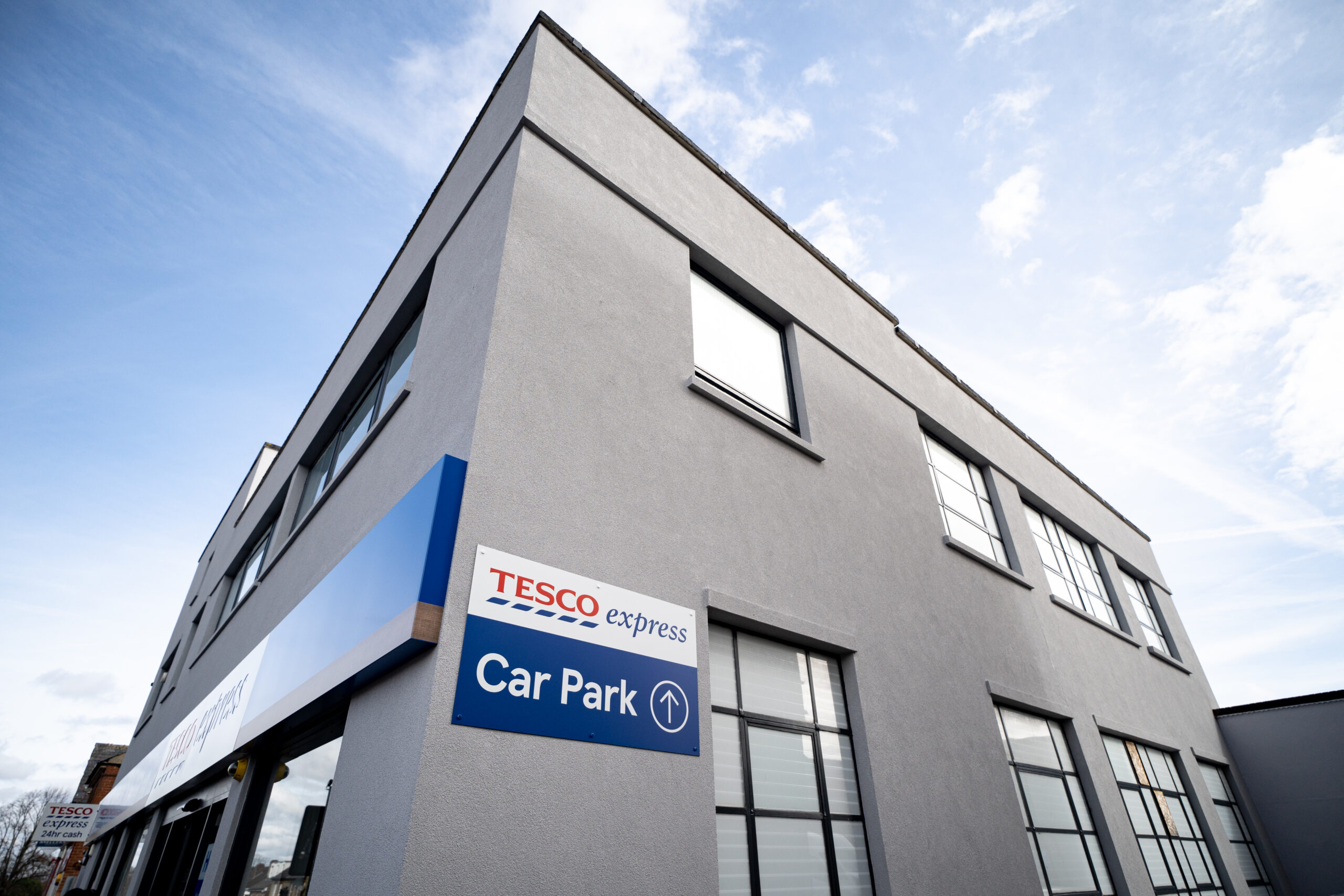
Below is an example of a project finished in the colour Ash, installed by Ralph Plastering.
Brilliant White ranks fourth and represents approximately 3.6% of EWI-075.
Its presence alongside Pure White means that two different white shades appear within our four most frequently selected colours.
Taken together, Pure White and Brilliant White account for approximately one-third of the EWI-075 represented in our data.
However, not all whites appear identical once installed.
Subtle differences in tone can become much more noticeable across a large rendered façade, particularly when viewed alongside other materials and under different lighting conditions.
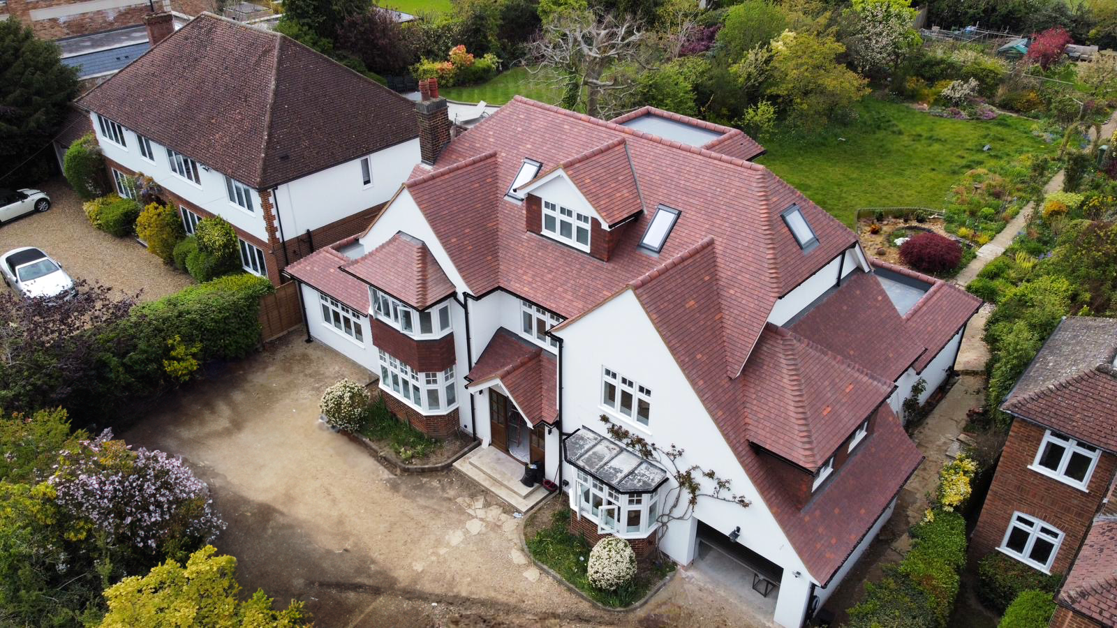
Below is an example of a project finished in the colour Brilliant White, installed by Global Rendering
Platinum accounts for approximately 3.1% of EWI-075, placing it fifth in our ranking.
Together with Smoke and Ash, its position reinforces one of the clearest trends in the data: grey and neutral finishes are consistently popular choices for rendered façades.
These shades can suit contemporary buildings particularly well, but they can also be used as part of more traditional refurbishment schemes where a cooler neutral finish is required.
Below is an example of a project finished in the colour Platinum, installed by Brodtech.
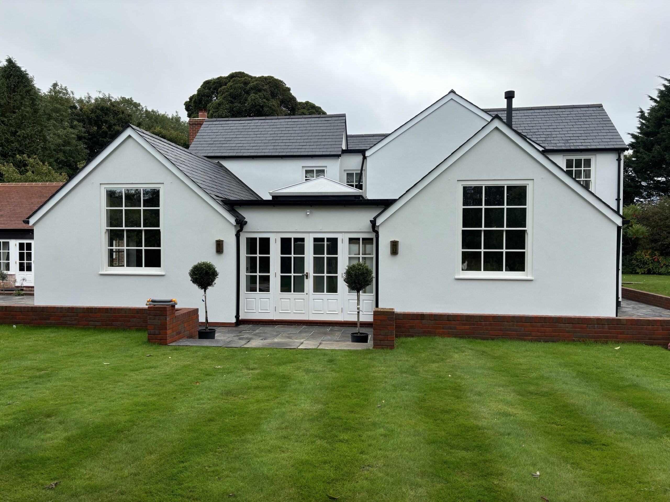
Magnolia also represents approximately 3.1% of EWI-075.
Its position in the top 10 shows that warmer, more traditional neutrals continue to be widely selected despite the popularity of whites and greys.
Warm shades can complement materials such as traditional brick, stone and timber and may provide a softer appearance than a bright white or cool grey finish.
This can be especially useful when external wall insulation is being installed as part of a refurbishment where the finished façade needs to sit comfortably within the character of the existing property.
Below is an example of a project finished in the colour Magnolia, installed by First Renderers.
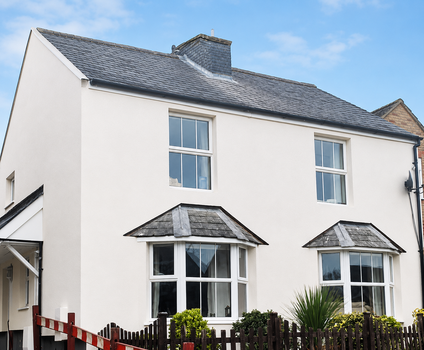
Ivory sits almost level with Magnolia, also accounting for approximately 3.1% of the EWI-075 represented in our data.
Like Magnolia, it provides an alternative to both bright whites and cooler greys.
Softer neutral shades can work particularly well where the intention is to create a light façade without the sharper contrast associated with a pure white finish.
They can also be useful when coordinating rendered elevations with traditional roofing materials, brickwork or natural finishes elsewhere on the building.
Below is an example of a project finished in the colour Ivory.
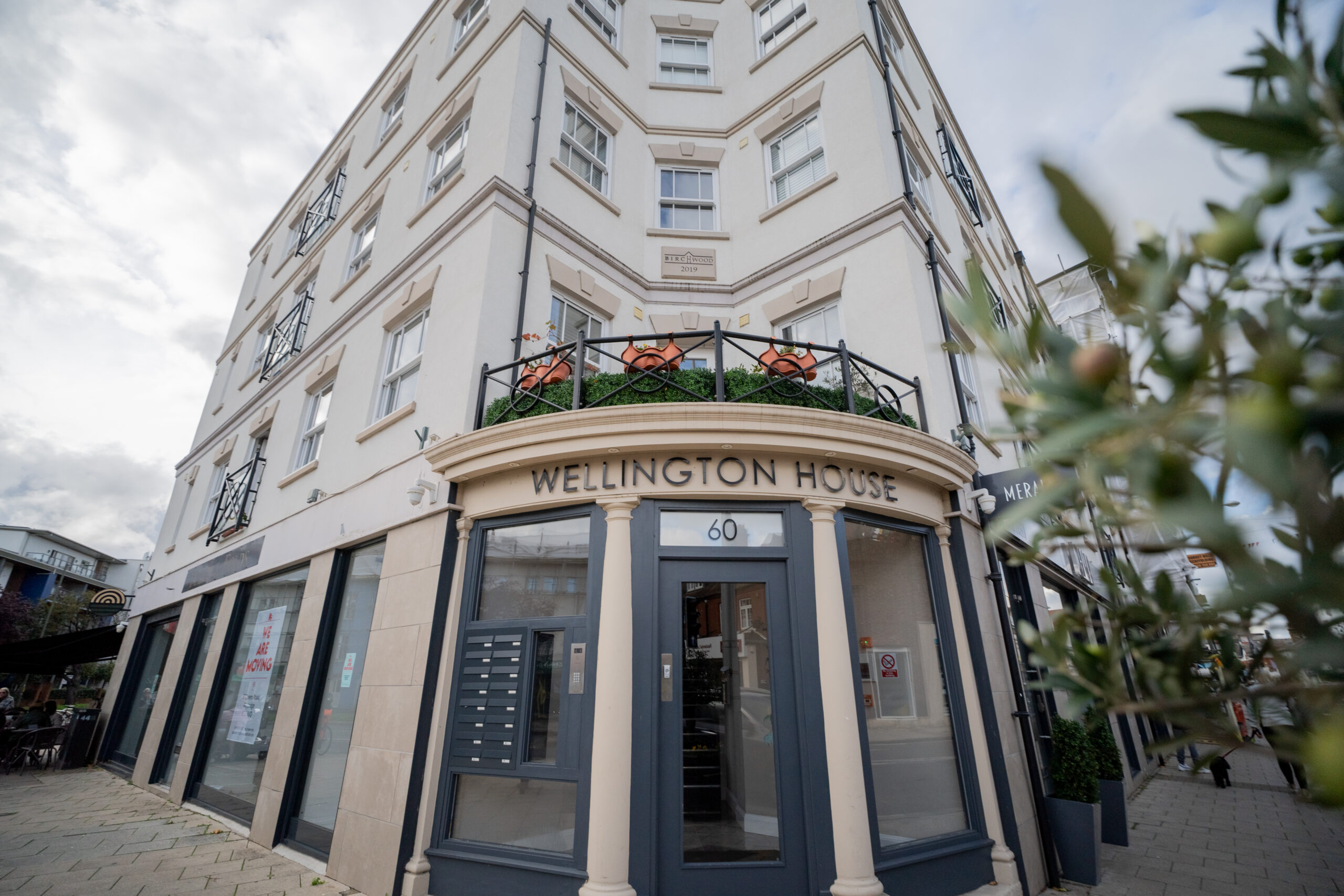
Diamond ranks eighth, with approximately 2.8% of EWI-075.
Its position adds further weight to the preference for relatively restrained and versatile façade colours.
For larger external wall insulation schemes, neutral shades can offer particular flexibility because they can work alongside several other materials without competing visually with them.
This may be useful where rendered areas are combined with brick slips, brickwork, cladding or contrasting architectural details.
Below is an example of a project finished in the colour Diamond, installed by Wall to Wall Plastering.
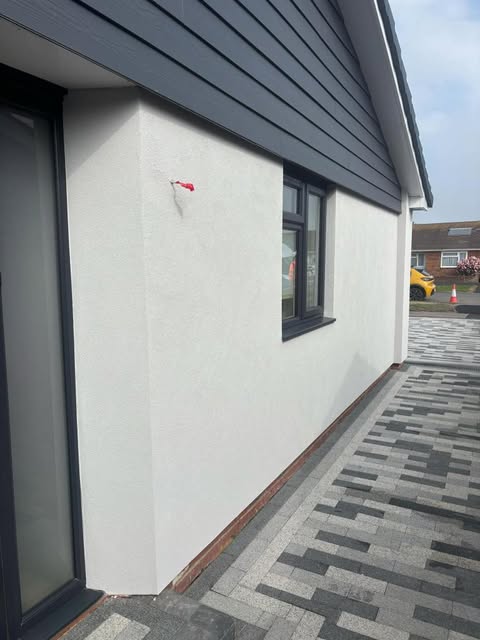
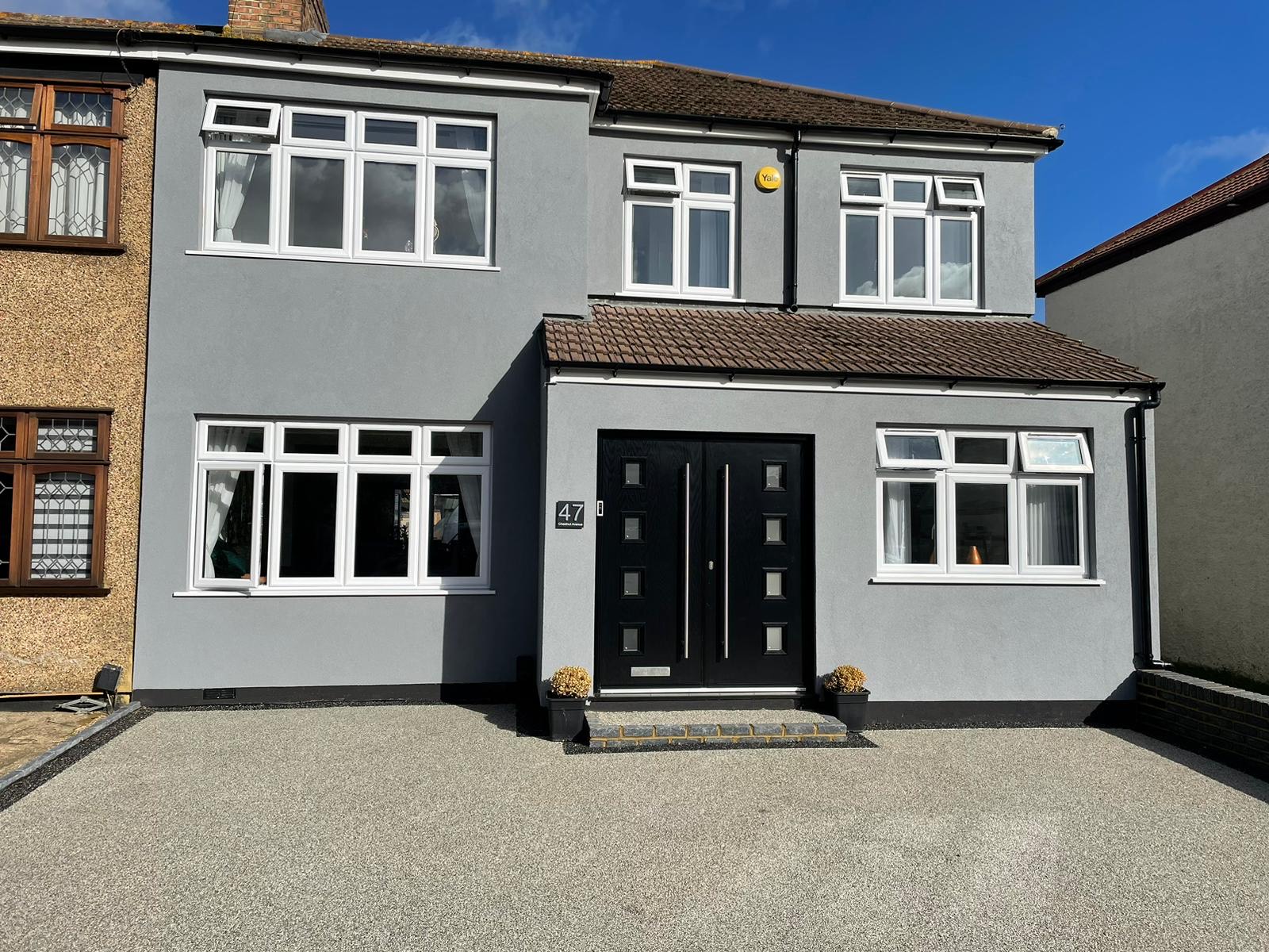
Lead represents approximately 2.6% of EWI-075 in our tinting data.
As a stronger, darker shade, it can introduce more contrast than many of the lighter colours appearing above it in the ranking.
Darker tones can be particularly effective when used selectively within a two-colour façade or to emphasise particular sections of a building.
However, colour should always be considered as part of the complete façade design and system specification rather than selected solely because it appears attractive on a screen.
Below is a project finished in the colour Lead.
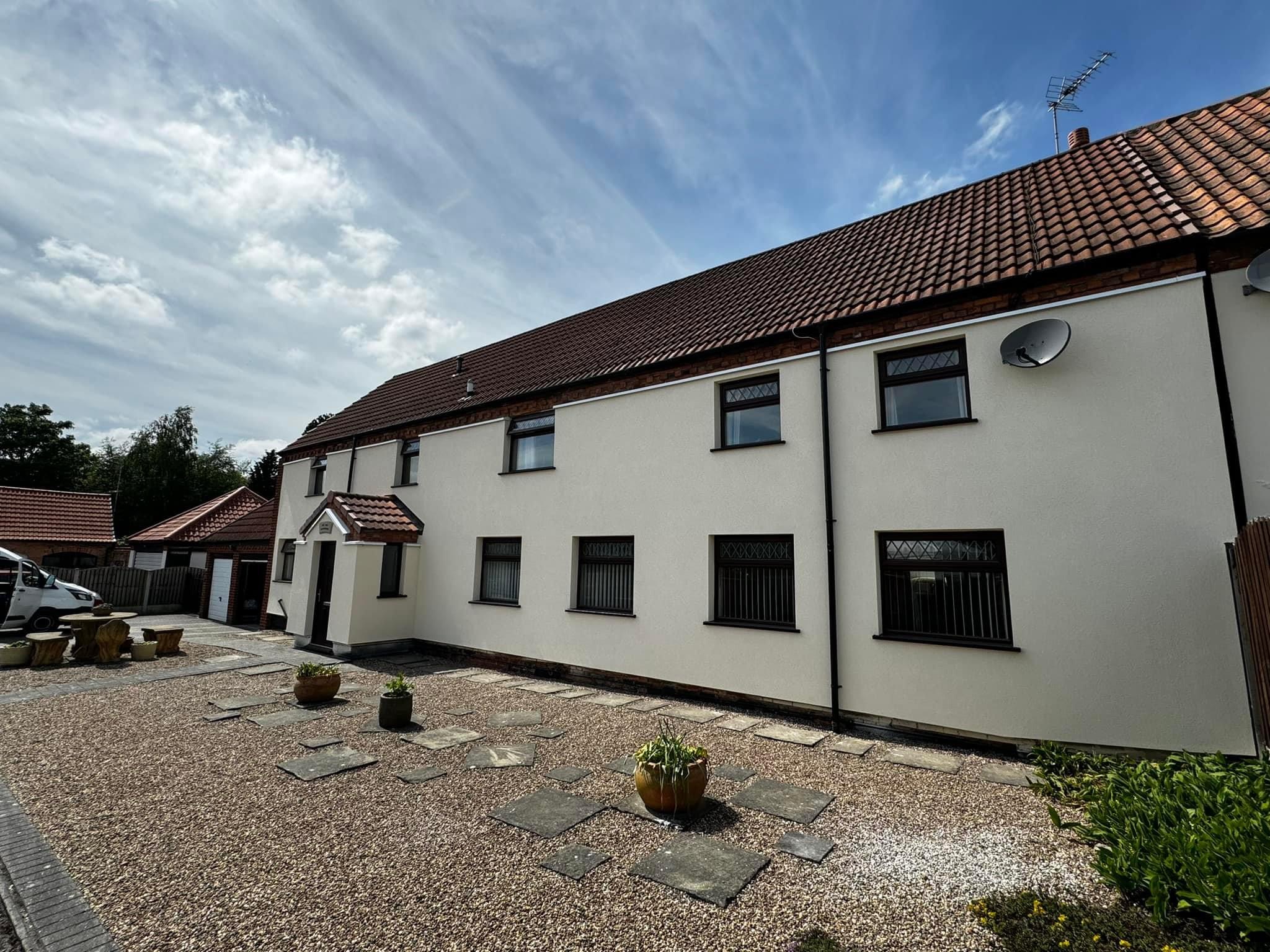
Completing our top 10 is Sandstone, which also accounts for approximately 2.6% of EWI-075.
Its position alongside Magnolia and Ivory shows that warmer, natural-looking neutrals continue to form an important part of render colour selection.
Stone-inspired colours can suit both traditional and contemporary properties and may be particularly appropriate where the rendered façade needs to complement natural materials elsewhere on the building.
Below is a project finished in the colour Sandstone.
The clearest finding is that neutral colours dominate our most frequently selected EWI-075 shades.
Pure White is by far the strongest individual colour, accounting for almost 30% of the data.
Smoke and Ash then account for a further 15.7% combined, demonstrating the popularity of grey-toned finishes.
At the same time, warmer shades such as Magnolia, Ivory and Sandstone all appear within the top 10.
Overall, the ranking points towards four particularly prominent colour groups:
While we offer a much wider colour palette, a relatively concentrated group of neutral shades accounts for a significant proportion of the EWI-075 being tinted.
For EWI and render projects, that is understandable. Render is often installed across substantial areas of a façade, making versatile colours that coordinate easily with windows, roofs, brickwork and other external materials particularly useful.
No.
Our data tells us which colours are selected most frequently, not which colour is objectively best for every building.
The appropriate render colour depends on the individual project.
Several factors should be considered before making the final choice.
Many external wall insulation schemes incorporate more than one external finish.
Existing brickwork, brick slips, stone, timber or cladding may remain visible alongside the render, so the selected shade needs to work as part of the complete elevation.
Window and door colours can significantly influence how a render shade appears.
Anthracite or black frames, for example, can create a much stronger contrast against a light render than lighter window finishes.
The colour relationship between these elements should therefore be considered before the render is specified.
The roof is another major part of the exterior colour palette.
Roof tiles, fascias, soffits and guttering can all influence whether a particular render shade feels cohesive once the project is complete.
On terraces, housing developments and other closely positioned buildings, the surrounding properties may also influence the final colour choice.
A shade that works well on a detached property may have a very different visual impact when installed next to several other elevations.
Some properties or developments may also be subject to planning conditions, conservation requirements or other restrictions affecting the external appearance.
Any relevant requirements should be checked before the final render colour is selected.
Yes.
A two-colour render scheme can be used to introduce contrast, define architectural features or separate different sections of an elevation.
This can be particularly effective on larger buildings where one continuous colour may not provide enough visual variation.
The important thing is to consider how the colours work together, rather than simply selecting two individually attractive shades.
Contrast can be created through light and dark tones, while more subtle schemes may use closely related neutral colours to distinguish different sections of the façade.
The colours should also be considered alongside windows, doors, roofing and any other external finishes.
Colour is only one part of the finished appearance of a rendered façade.
The grain size and texture of the render also influence the way the surface looks.
Different textures interact with light and shadow differently, meaning the same colour may not appear completely identical across different finishes.
EWI-075 Silicone Render is available in a choice of grain sizes, allowing both the colour and surface texture to be considered as part of the overall façade design.
This is why we recommend looking at colour and texture together rather than treating them as completely separate decisions.
We would not recommend making the final specification from an online colour alone.
Digital colour representations are useful for comparing options and narrowing down a shortlist, but screens can reproduce colours differently depending on the device, brightness and display settings.
The appearance of render also changes depending on:
A colour that appears one way on a laptop or phone may look noticeably different across an entire external elevation.
For this reason, a physical render sample should be viewed wherever possible before the final colour is confirmed.
Our tinting data gives a useful indication of the shades that are being selected most frequently, but popularity should be a starting point rather than the deciding factor.
Pure White 20001 is clearly the most popular individual EWI-075 shade in our data, followed by Smoke 27416 and Ash 27412.
More broadly, the ranking shows a strong preference for whites, greys and warmer neutral finishes.
When specifying a colour for an external wall insulation or render project, consider the complete building:
Our Render Colour & Texture Guide can help you compare different shades and finishes before narrowing down your options.
Once you have a shortlist, we recommend viewing physical samples before committing to the final colour for the complete project.
Based on our EWI-075 tinting data, Pure White 20001 is the most frequently selected shade, representing approximately 29.5% of EWI-075 in the dataset.
Smoke 27416 and Ash 27412 are the two highest-ranking grey-toned shades in our EWI-075 data, placing second and third overall.
Platinum and Lead also feature within the top 10.
Yes. Pure White ranks first and Brilliant White ranks fourth in our data. Together, the two shades account for approximately one-third of EWI-075 represented in the dataset.
Magnolia, Ivory and Sandstone all appear within our top 10, showing continued demand for warmer cream, off-white and natural neutral finishes.
Yes. Online colour representations can vary between screens and lighting conditions, so we recommend viewing a physical sample before making the final colour specification.
Yes. Two-colour schemes can be used to create contrast, define architectural features or separate different areas of an elevation. The colours should be considered alongside the rest of the façade and specified as part of the overall design.